
Upon login, the User is immediately presented with some visual data on what is going on in the system, both upcoming activities as well as some sales metrics. Diving further into the system, each screen has a button on the left side that is “Charts”. Clicking over to the Charts view gives some default visualizations of what is taking place in the related list.
As example, here are our Orders Charts from the Demo installation:
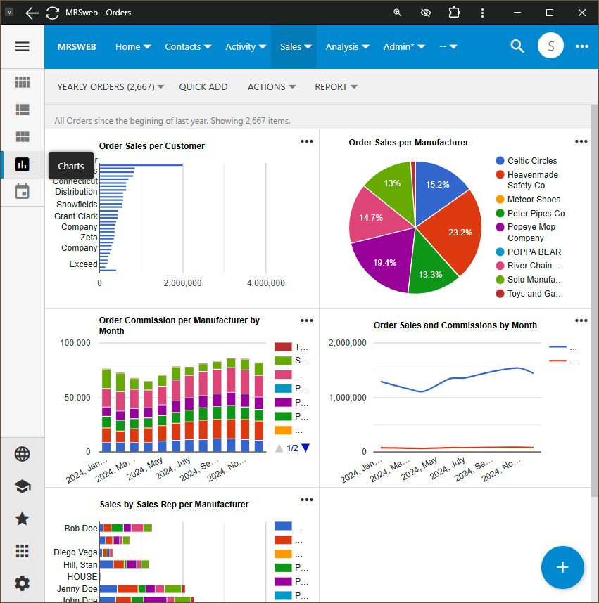
Each Users’ Listing, and thus their Charts are filtered to show what their own login has permissions to see. The numbers shown in Charts are not just based on permissions, but do update as the User filters to further dive into the information.
For example, it is easy to show these same charts by Manufacturer, Order Date, Territory, and/or assigned Rep. All the User needs to do is filter from the “…” menu on a Chart, or from the main listing (by clicking the Grid, List, or Card view buttons above the Charts button). As filters are applied, the Charts automatically update — looking for Sales by Rep for a single Manufacturer, filter on the Manufacturer’s name; looking for sales in a geographic territory(ies), filter by State or City.
Since every listing has Charts, there are a lot of visualizations to explore. Not finding what you are looking for? Reach out to us or comment here, and we will either point you in the right direction or add it if we can.