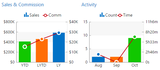
These consolidated charts each have independent Y-axis on the left- and right-sides. The bars in the chart go with the axis on the left; the line on the chart goes with the axis on the right. This 2-axis system allows for both better use of page space on smaller devices as well as an interesting comparison of the relationship of the metrics involved... For example, if sales are going up but commissions are staying the same (e.g. in a case of decreased commission rates), this would be visible as a greater increase in the relative size of the bars vs the line; likewise a greater increase in the number of sales calls vs the time spent on each would show in the same way on the Activity chart.

|
|
|
MRSware is an EYOND Integrated Solution
made in Austin, TX USA |

 RSS Feed