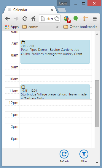
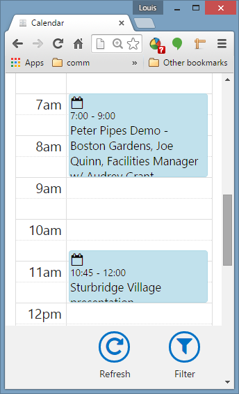
MRSweb, however, is different. Due to the nature of the design -- responsive web design -- Users have the ability to zoom in to make things larger, and the app will reorganize itself to fit the contents on the screen at the new size.
| Take a look at this example, emulating a smaller-size screen, that shows 100% zoom vs. 150%. As you can see in this example, zoomed-in shows bigger fonts (and menus, buttons, etc.), but also reduces the amount of information on screen. The development team has been taking care to strike a balance between amount of information and the readability, and the User has the ability by using the Zoom feature in the browser to adjust that larger as needed, and as makes sense for their individual device. | The Zoom function will be found in different places on different devices: a. Start by looking in the browser's menu on your device. Typically there is an option their to control the precise setting. b. Another way found on most devices to zoom is to pinch-together or pinch-apart on the screen or touch-pad. Putting your two fingures together in the middle of the screen, then moving them apart diagonally typically does a zoom-in. |


 RSS Feed